|
|
|
SHARK INFO |
|
SHARK |
|
SHARK EVOLUTION |
|
|
|
SHARK DIVING |
|
SHARK DIVING 101 |
|
|
|
CONSERVATION |
|
|
|
PHOTOGRAPHY |
|
SHARK PHOTO TIPS |
|
|
|
RESOURCES |
|
|
|
WEB STUFF |
|
WHAT IS ELASMODIVER? Not just a huge collection of Shark Pictures: Elasmodiver.com contains images of sharks, skates, rays, and a few chimaera's from around the world. Elasmodiver began as a simple web based shark field guide to help divers find the best places to encounter the different species of sharks and rays that live in shallow water but it has slowly evolved into a much larger project containing information on all aspects of shark diving and shark photography. There are now more than 10,000 shark pictures and sections on shark evolution, biology, and conservation. There is a large library of reviewed shark books, a constantly updated shark taxonomy page, a monster list of shark links, and deeper in the site there are numerous articles and stories about shark encounters. Elasmodiver is now so difficult to check for updates, that new information and pictures are listed on an Elasmodiver Updates Page that can be accessed here:
|
|
_ |
|
SHARK PHOTOGRAPHY - COMPOSITION |
|
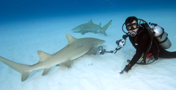
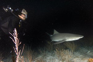
Tom Burns shooting Lemon sharks in the Bahamas
Question: What makes a good shark photograph? Most photographers will tell you that composition is the key. Lets take a look at the image at the top of this article. The Lemon's tail is cut off, its swimming away from the camera, Tom's leg is also cut off, he's looking straight at the camera, (conventional wisdom says he should be looking at the subject) and the horizon isn't straight. OK, so did I blow the shot? I don't think so. Good composition doesn't necessarily mean that you have to follow all the rules. What is this image saying? To me it says: Check me out, here I am shooting sharks and they're getting really close. Tom's intense stare while not traditionally desirable is engaging. Shame about that horizon though.
|
|
|
|
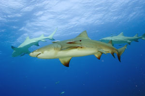
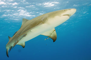
Now lets play by the rules again while we examine two more Lemon shark pictures. They are obviously similar; both taken from below with about the same exposure. So, why does the image on the right have so much more impact? After all, there are three sharks in the other picture. Part of good composition involves understanding how to convey the size of the shark to the viewer. Sharks are big creatures. If you leave too much blue space around them they appear smaller than life. If a shark is heading straight for you (and you can fight the urge to get out of the way) then there's no problem filling the frame because the sharks head and pectoral fins are more or less the right shape to do the job. If the shark is just cruising by as it is in the left picture then it forms a thin line across the screen. Then, even if its almost touching the edges it still wont take up much of the blue space. It is better to attempt a diagonal shot like the image on the right if you get the chance. because it allows you to get as close as possible before the shark's extremities are cut off. The closer you are, the bigger it looks against the background.
|
|
|
|
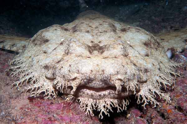
Lets get back to that head on shot. The Tasseled wobbegong above, presents its own unique composition challenges. Usually photographers try to shoot face shots from below where the teeth stand out menacingly. But, the wobbies mouth being terminal (at the front) doesn't fit with this formula. It's most striking feature is its beard of skin flaps protruding from its chin. Because of its flattened body shape I had to rise up a little to give the shark a more three dimensional feel. Also, for years I have been fighting the urge that I have to include the entire animal in the frame. If in this shot I had zoomed out or backed off to include all of its fins, the bulbous fleshiness of the wobbegong's head would have been lost, and it would have had much less impact than it does with its head dominating the frame.
|
|
|
|
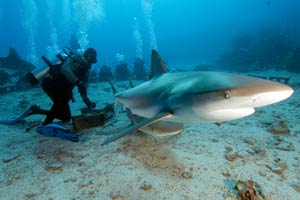
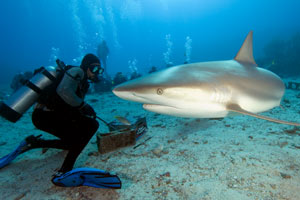
Where you direct the viewers eyes is an important aspect of composition. These two pictures of a shark feed in St Maarten are virtually identical in most ways but the shark on the left is on its way out of the frame. This subtly leads the eyes away from the picture. In the second image, both the shark and the diver are looking towards the centre of the frame. This composition keeps your attention focused on the picture longer. Photographing the shark swimming towards the diver also implies that the diver is interacting with the shark rather than simply observing it swim by.
|
|
|
|
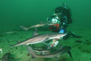
Another way to play with size: Its important to understand that the position of the diver relative to the shark can also influence the way that we interpret size. The Spiny dogfish sharks that appear on the left are barely 3ft long, but because they are in front of the diver and close to my lens, they appear to be very big and commanding. The other picture which shows a Lemon shark at night, portrays what looks like a juvenile fleeing from a diver. This puny looking specimen is actually about 7ft long but because the diver is so much closer to the lens it looks proportionately tiny.
|
|
|
|
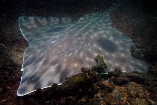
The rule of thirds. This is my favorite rule to break. It says that the eye is most pleased by images in which the subjects are poised at the intersections of lines that dissect the picture into nine equal parts...huh? In other words, don't put the subject right at the corners, edges, or smack in the middle. While this may be true for compositions of subjects in which the background is important, its misleading when you're trying to create high impact pictures of sharks. My humble advice: FILL THE FRAME. If you get it right it with be very engaging and will probably comply with the rule of thirds anyway, like this picture of a Big skate from Vancouver Island.
|
|
To sum up...
That's all fine and dandy but remember that rules stifle creativity. Don't be afraid to experiment. You may end up with something spectacular. Andy Murch works as a Photographer for Shark Diver Magazine. HOME LINKS TAXONOMY UNDER THREAT BOOKS CONTACT
|
